
.webp)
Friendly Manager wanted to provide more accurate data to its customers when it came to the number of member the organisation hadand what type of members they had. It was my job to make that dream a reality.
Friendly Manager is a platform designed to help administer community and sporting organisations. They have over 500 clients using the platform which is designed around reducing time for volunteers.
Friendly Manager needed to upgrade the dashboard of the platform as the company was starting to partner with larger sporting and community organisation's who had different data requirements. By using the design thinking approach we created a customisable dashboard interface.
This project needed to get all the right people in the room, so before we started we got the developers clients and product team in the room to fully understand what the clients needed. It was clear there were going to a be a few challenges here, and that we needed to ensure the platform was up to the tasks.
Very quickly I could see from the range of clients there were some key similarities and some key differences that we were going to need to incorporate in to the design and platform.
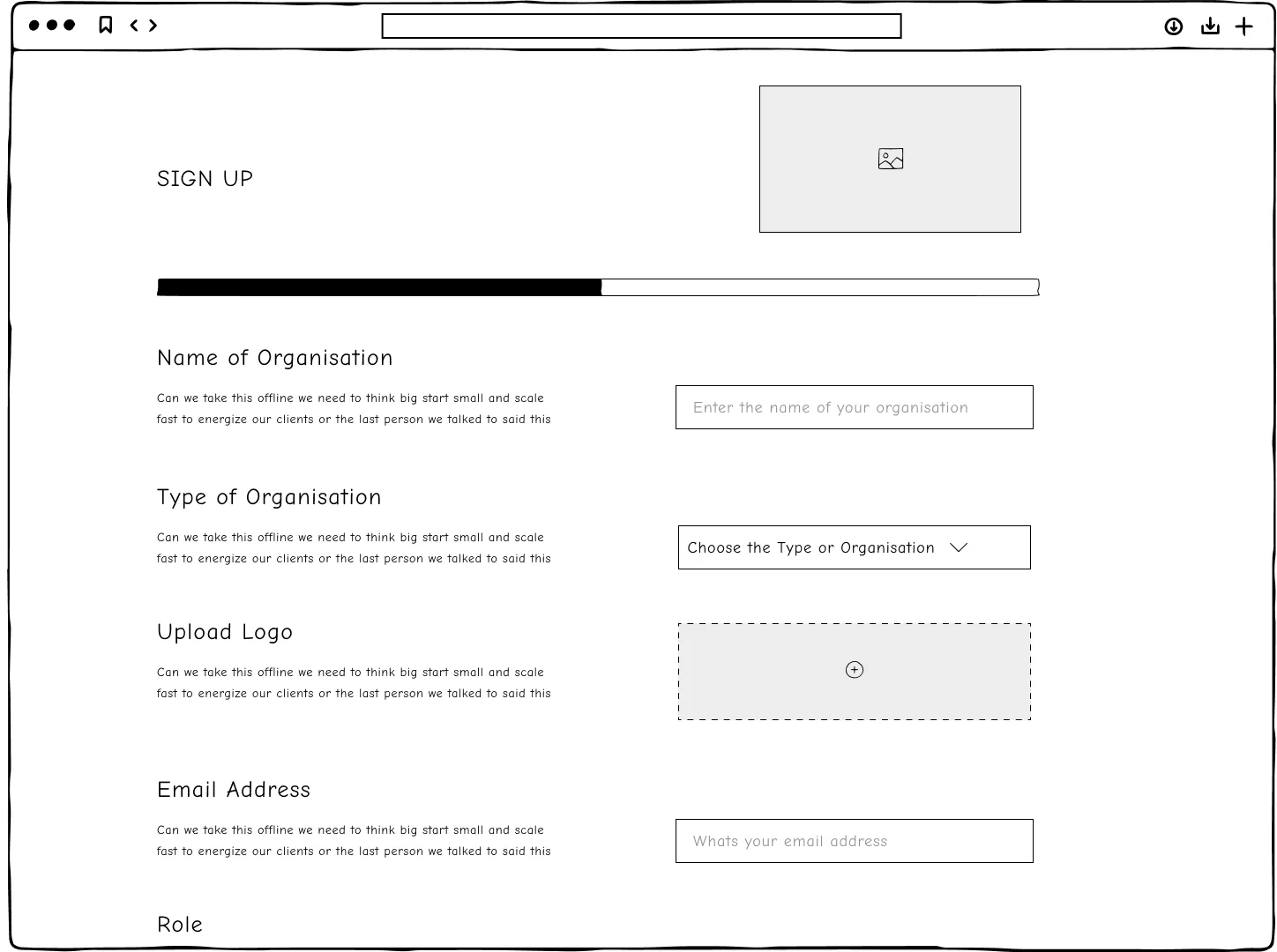
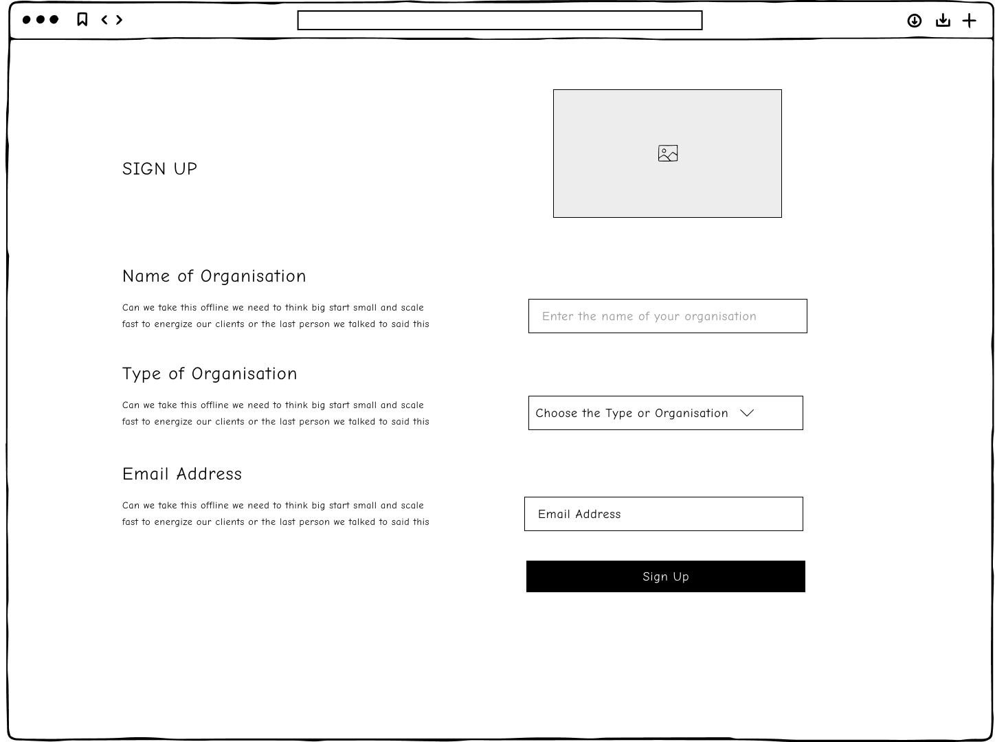
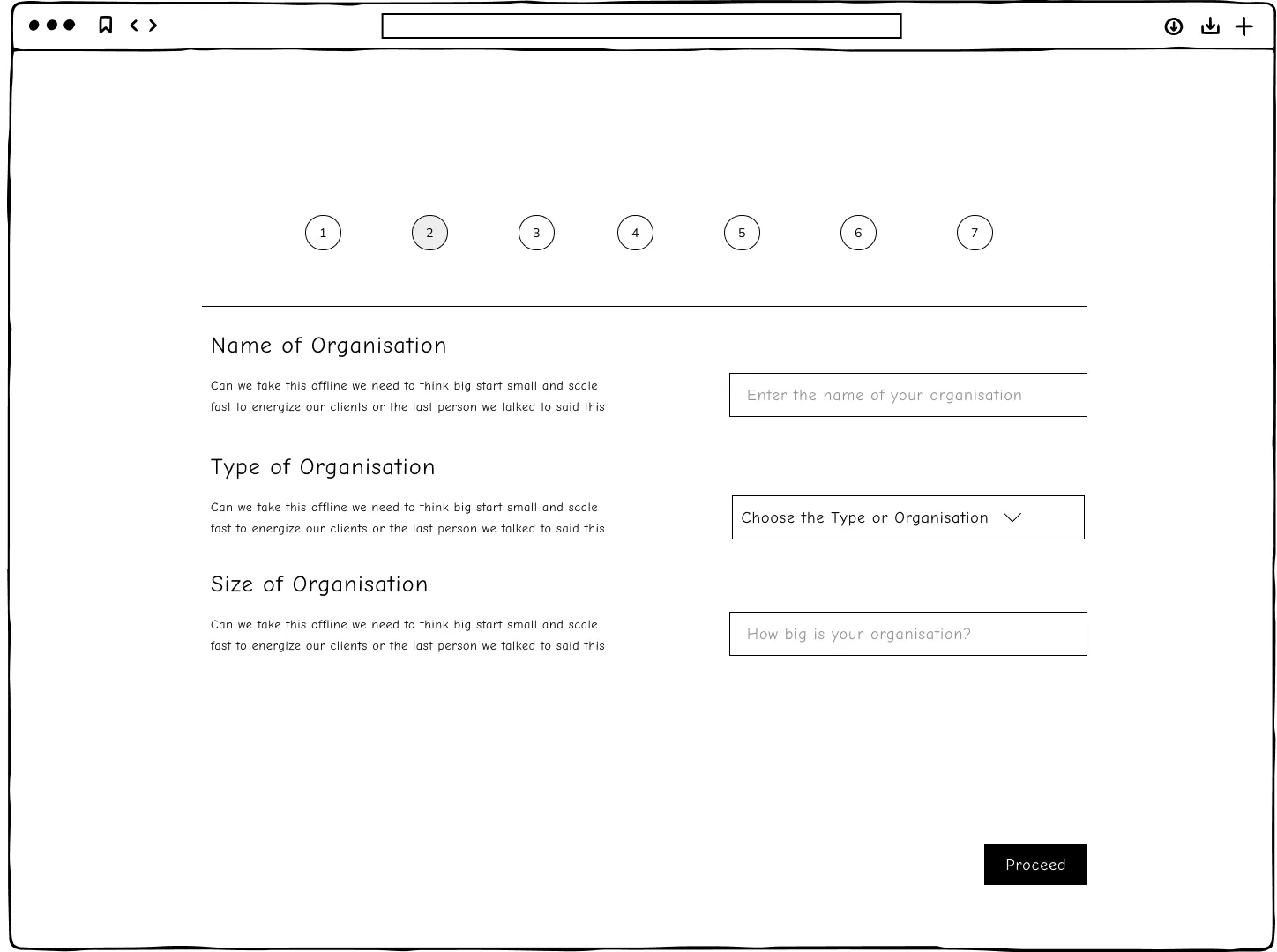
When working on dashboard I knew the different components that were needed, I just needed to know the layout and if we wanted to design for the ability of customisation from the start. Below are some wire frames for the dashboard I designed
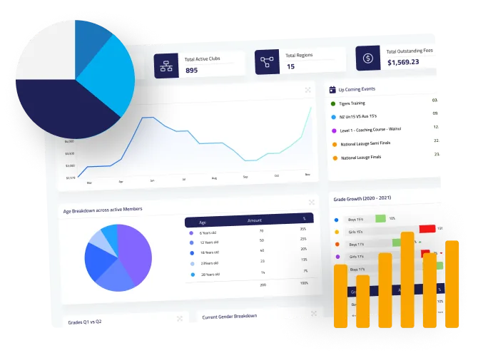
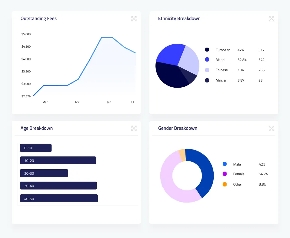
The final solution was centred around not only the user of today (the everyday club) but the user of tomorrow. We wanted the dashboard to be customisable in future. We first focused on the four core demographics: Age, Gender, Location, Ethnicity. By adding a drag and drop module creation platform I was able to create the ability to customise the dashboard to future user requirements.
Customisation was key to this project. Although the MVP didn't have customisation on the dashboard, I designed the system to have this customisable feature right from the start, so that this could be useful at a later date.
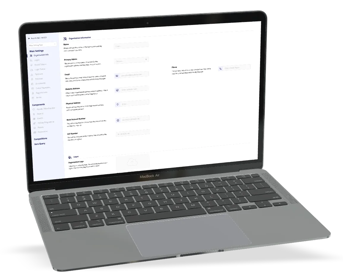
Users from national and regional organisations could configure the dashboard to meet the requirements they had. This was important as each user required the ability to have multiple and different dashboards.
.png)
One of the biggest challenges that I had with designing the dashboard came down to the the dynamic data and the fact that different organisations had different amounts of data they needed to report on.
When I spoke to the range of high-level organisations there were no commonalities in their requirements. This meant that I needed to make the platform dynamic and able to be changed by the user. This also meant that I needed to have graphs that were dynamic and could produce reports the user needed.
.webp)
I needed to think about the everyday user or the club user who just needs a simple, easy to use dashboard. I worked with everyday users as well as the wider groups and high-level organisations to find out which default graphs were required across the board.
I quickly realised that these graphs that were required by all were majority fundraising requirements. This meant that I designed the default dashboard to include a financial outstanding graph. This graph was carried over from the previous dashboard, and then I added some simple graphs for age, ethnicity, location and gender.
The club now has exactly what they need for funding applications at the push of a button.


.....
As the Project Lead I was really excited to see how the final design came out. It incorporated everything the project team and the clients needed. By using human centred UX/UI design we were able to include the ability to have set graphs which made it super easy for users at all levels of the organisation.
I also created the ability to take the data to the next level and allow users to customise the dashboard to report on the exact data they needed.
One more bonus is I was able to create a fresh and clean dashboard for today's market. Overall the project was a great success and I look forward to seeing it implemented.
.png)