
Case study · Nonprofit SaaS onboarding
Infoodle Customer Onboarding
Infoodle needed more users to reach their platform and sign up without help from the support team. I redesigned the customer onboarding to make signing up clear, simple and human.
.webp)
Project vision
Infoodle is a management platform for churches, community and not-for-profit organisations — donations, communications, events and everything in between.
Infoodle approached me with a challenge around users logging in and signing up. After some research I concluded the platform did not identify the customer enough — and this became a core attribute to the success of the project.
5 challenges
- Create an easy-to-understand workflow for users
- Allow users to recognise easily how to sign up
- Increase usage on mobile for the client's users
- Design for a wide range of user technological skill and capability
- The design was outdated and needed a refresh
Project kick-off
I sat down with Richard, CEO of Infoodle, to understand who the user is and how they currently sign up. It was clear there were a few challenges in the sign-up process. I also wanted the platform to handle single sign-on from multiple providers including Xero, Google and Magic Link, and to fit a bigger project where users could upload people data from another source.
Questions I needed to answer
- What is the minimum information we need to capture to complete sign-up?
- In what order do we ask users to enter that information?
- What other platforms did Infoodle admire for signing up?
- Could we share the story and highlights of Infoodle without distracting the user?
- How do we remove confusion about what "demonstration data" needs to be installed?
User personas
Understanding the users and their needs is critical to designing the right application. In this project there were two core user types.
David Thompson
Church administrator
David has been deeply involved in the administrative side of religious organisations for over a decade, with a degree in Business Administration focused on non-profit management. He wants to use technology to streamline operations and improve outreach.
Sarah Ngatai
Non-profit administrator (NZ)
Sarah has a rich history in administrative roles within non-profit organisations, focused on community development and social services, with a diploma in Social Work. She is empathetic, resourceful and passionate about making a positive difference.
User journey
A successful project starts with understanding the user and how they flow through the product. I mapped the full user flow for the Infoodle onboarding process before designing any screens.
Wireframes
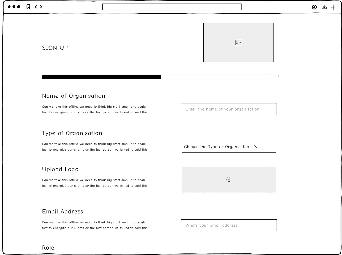
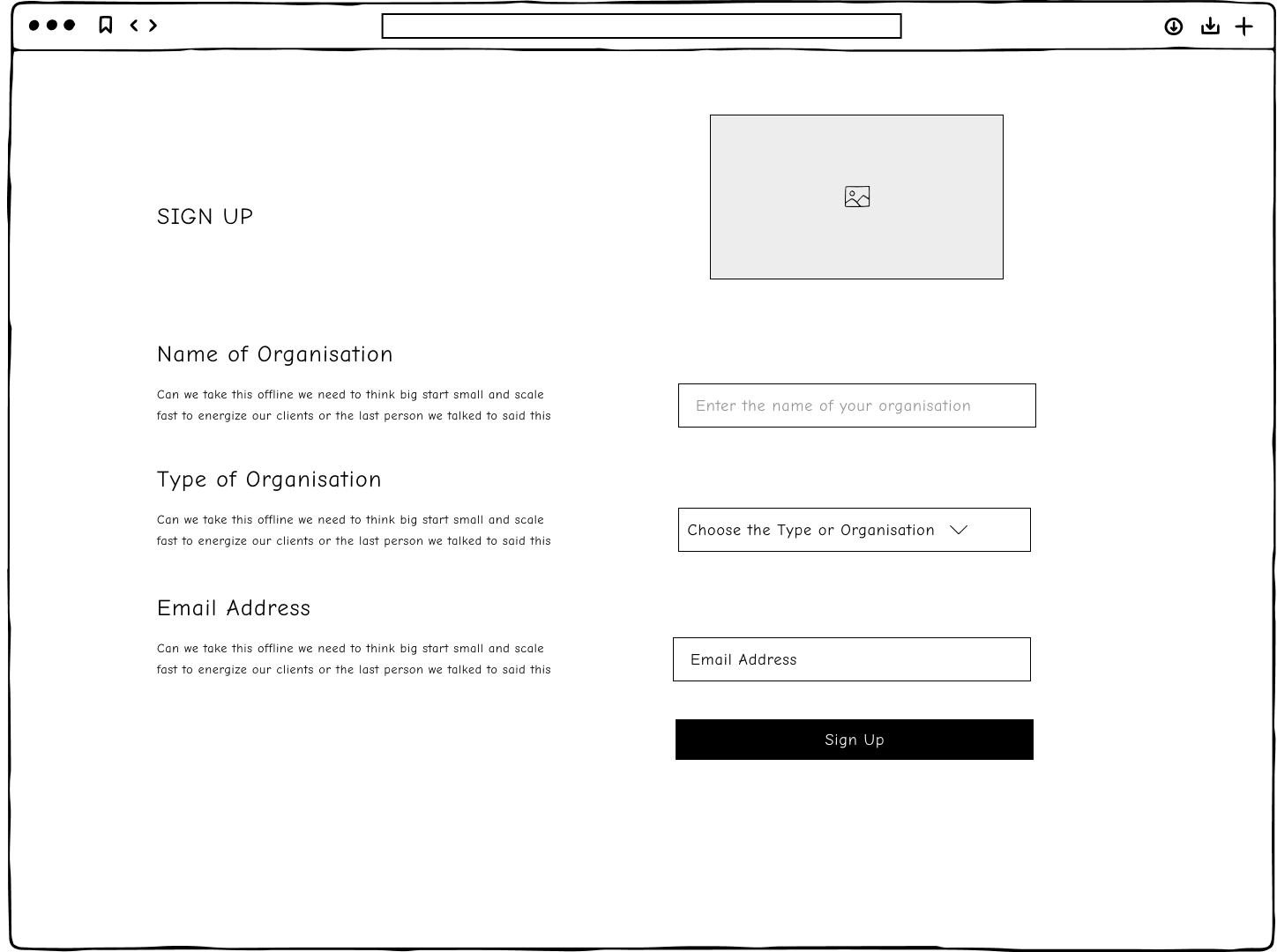
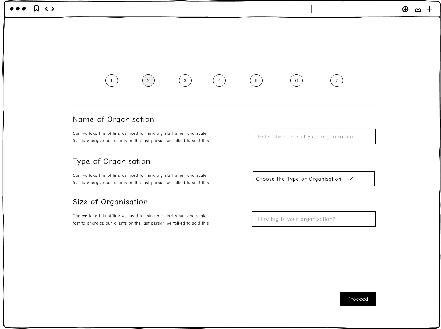
Before moving to high-fidelity, I wanted a feel for the core of the onboarding process. We came up with three concepts: a one-pager, a verify-first solution, and one broken into multiple sections. We chose the last — it created the most personal, human-centred approach.
Key points from the design
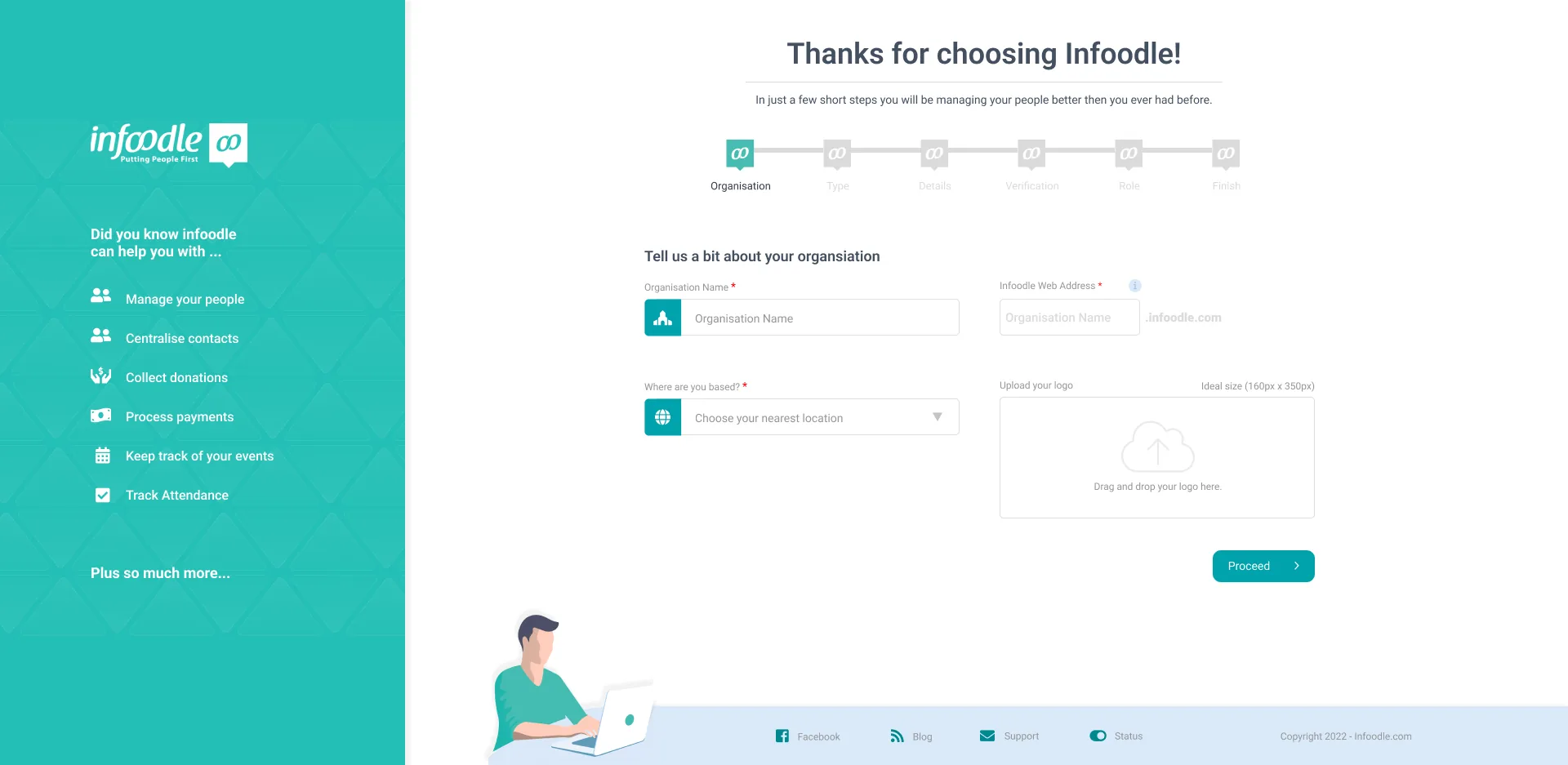
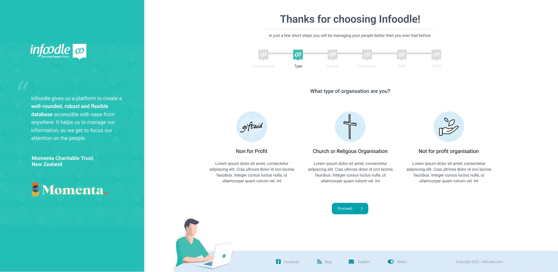
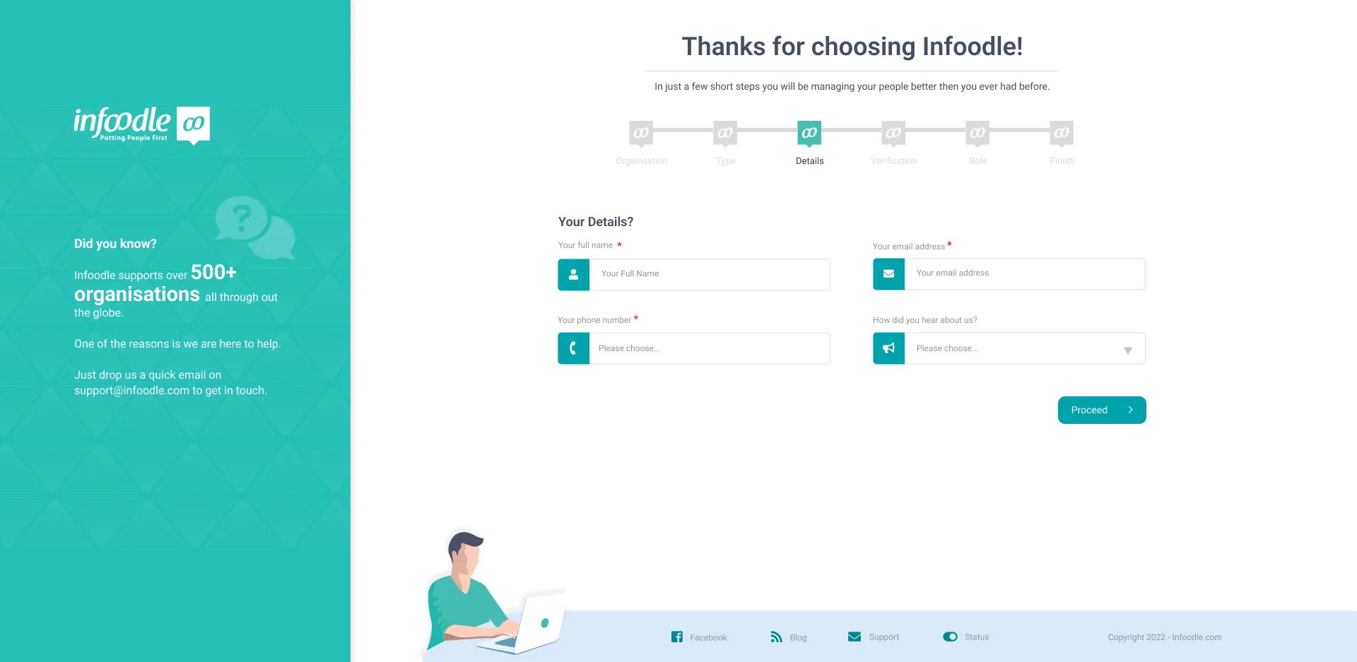
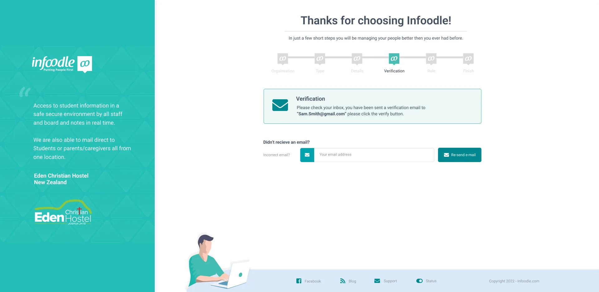
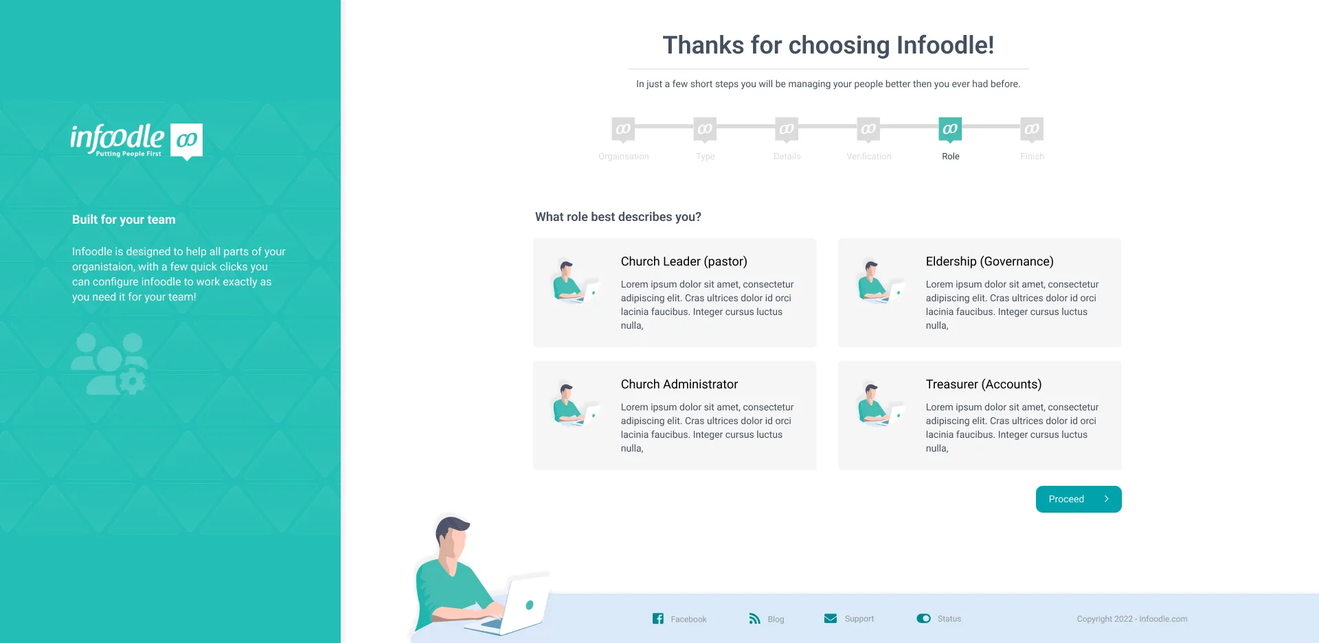
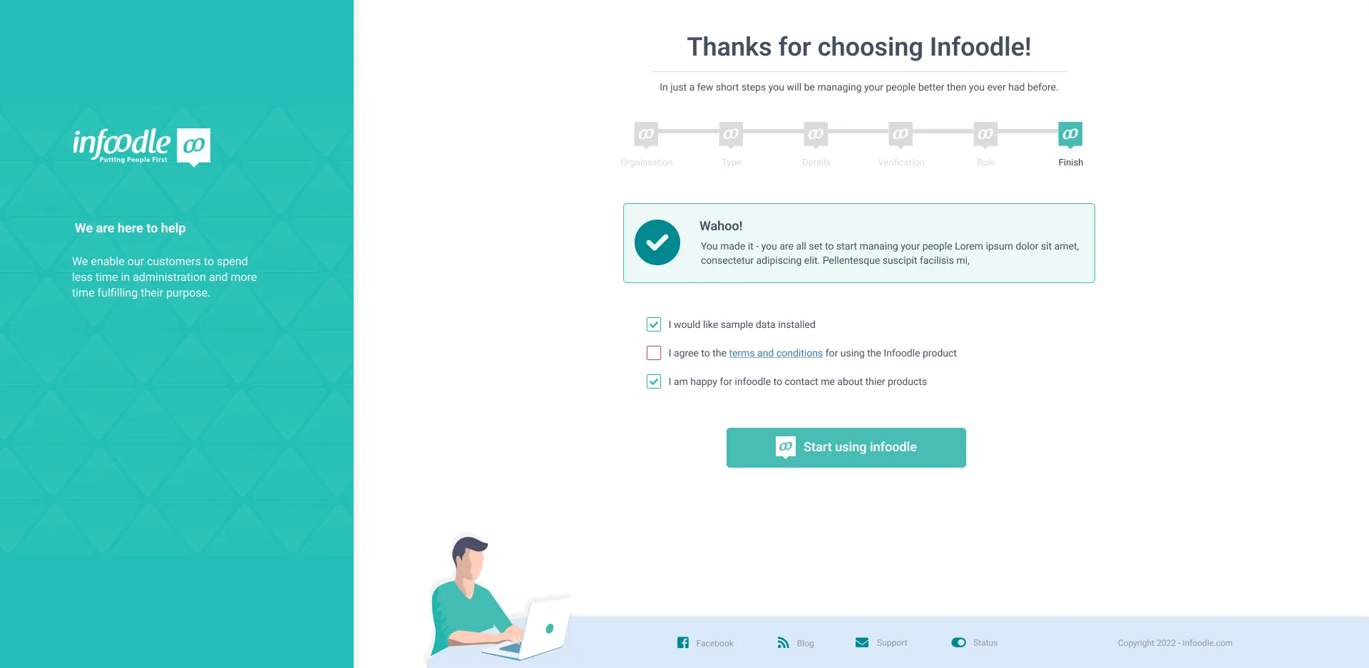
The final solution consisted of seven steps. While that sounds like a lot, breaking content into relevant sections — and showing progress — made users far more comfortable with the whole process.
User ownership
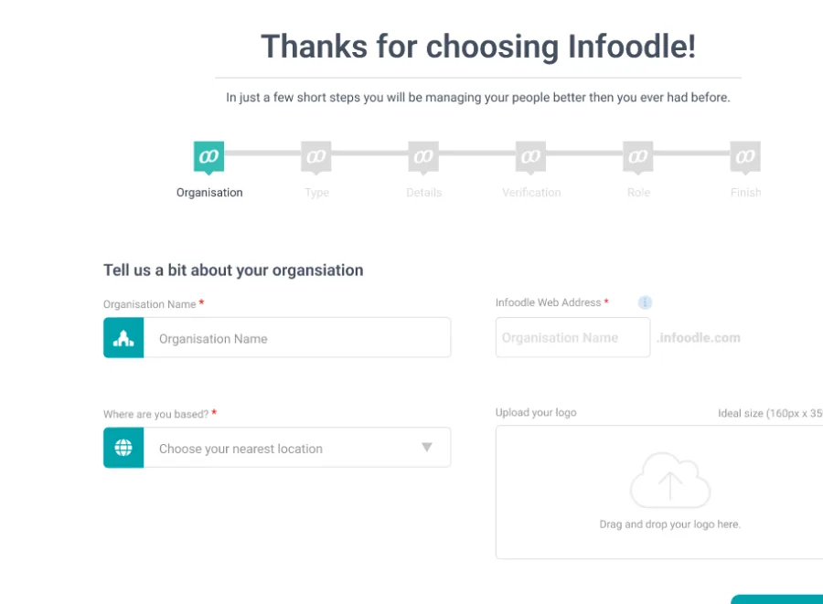
Organisations wanted the platform to feel like their own. We let them upload their logo and cover shot, so the moment they logged in it felt like their piece of software.
Familiarity
With many different user groups, we made the sign-up dynamic based on selections — location, type of organisation and the person's role. This sent us back to the drawing board on step order, but made the flow smooth for everyone.
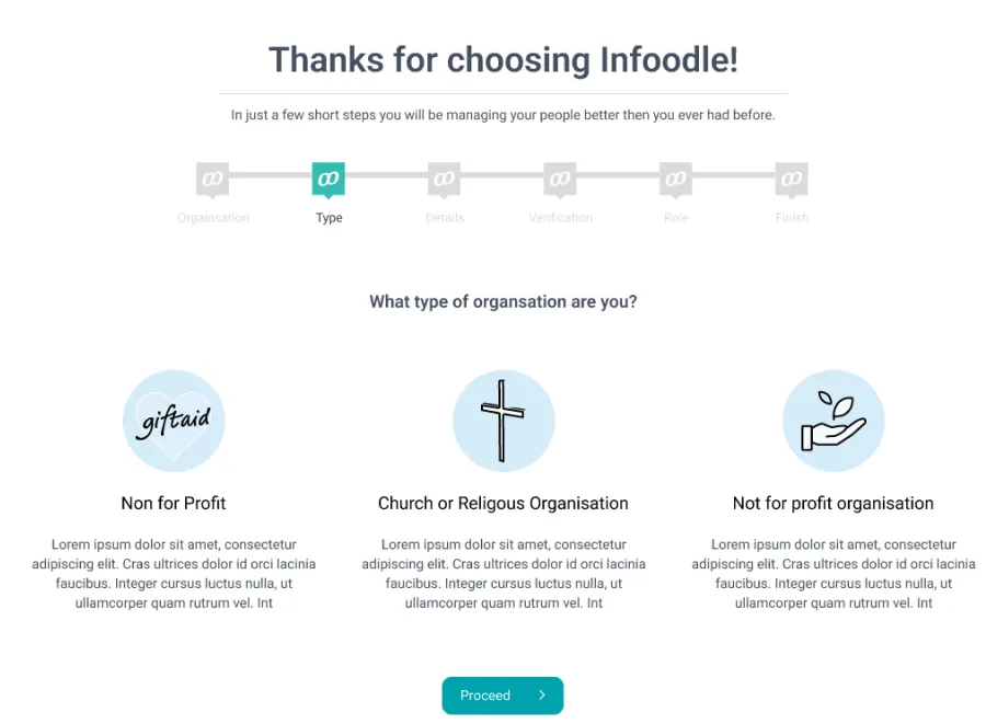
Simplicity
A wide range of users meant the flow had to be simple. We removed clutter and moved the user into a dedicated part of the platform — giving freedom on look and feel, while keeping them clearly connected to Infoodle throughout.
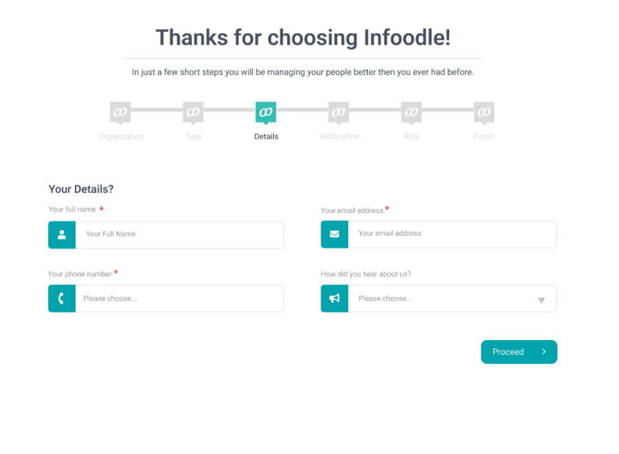
The human touch
A key value throughout was the "human touch" — support the user feels during sign-up. We used the left-hand column for testimonials, key features, what the customer can expect, and how to contact Infoodle for help.
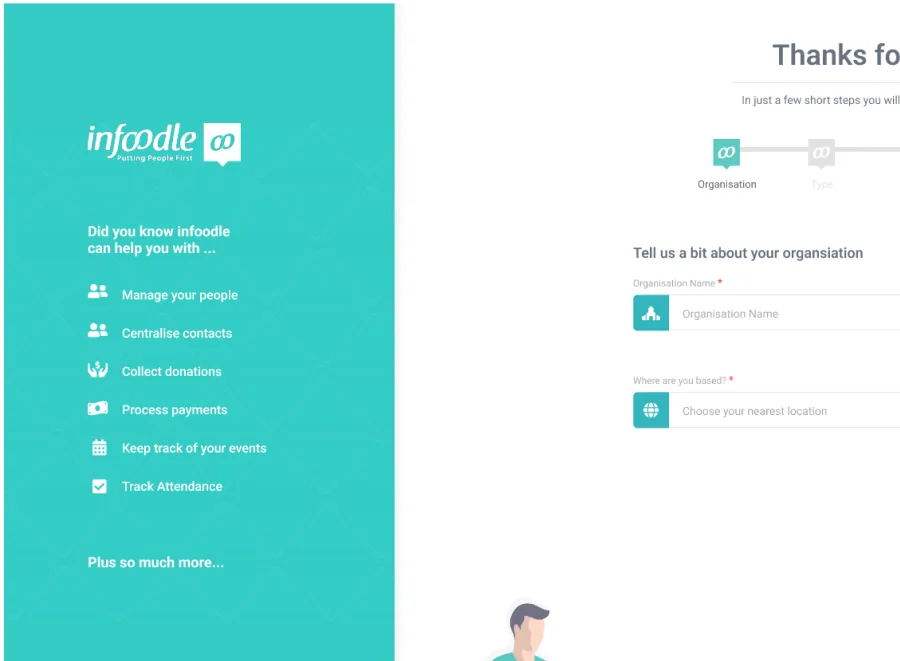
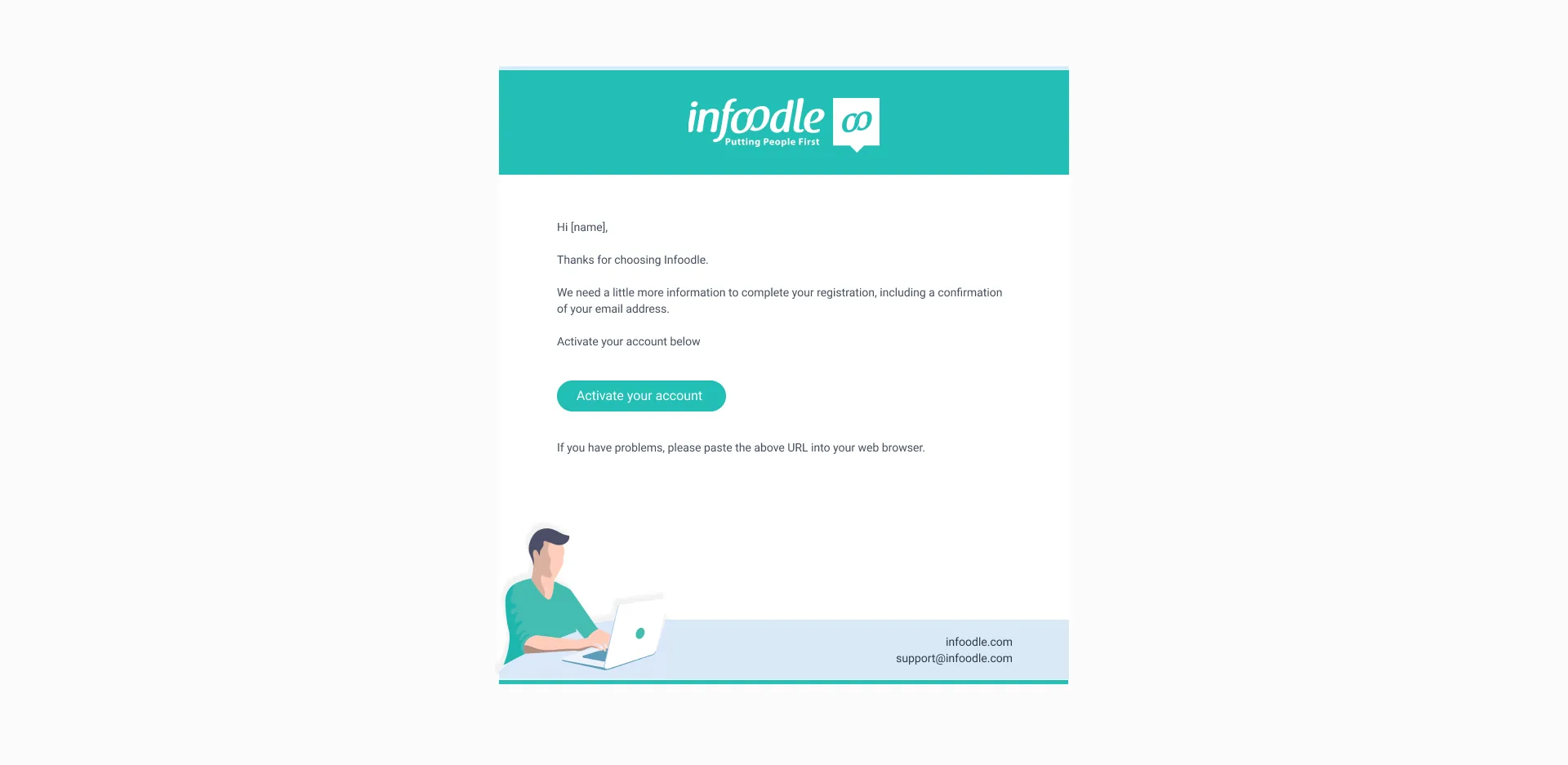
The final design — seven steps
What I learnt
I gained firsthand insight into the power of design systems and how much they speed up the process. I also explored enhancing sales value within the sign-up without overwhelming users — and enjoyed the challenge of balancing the teal brand colour across the page.
Final thoughts
By working with the Infoodle team and truly understanding the user, we achieved a great onboarding experience — users now sign up and enjoy the process. It led to more projects for Infoodle, including a login upgrade and data upload that fit neatly with the onboarding flow.
Since completing this project I've been asked to continue designing the rest of the Infoodle platform.
.webp)

