
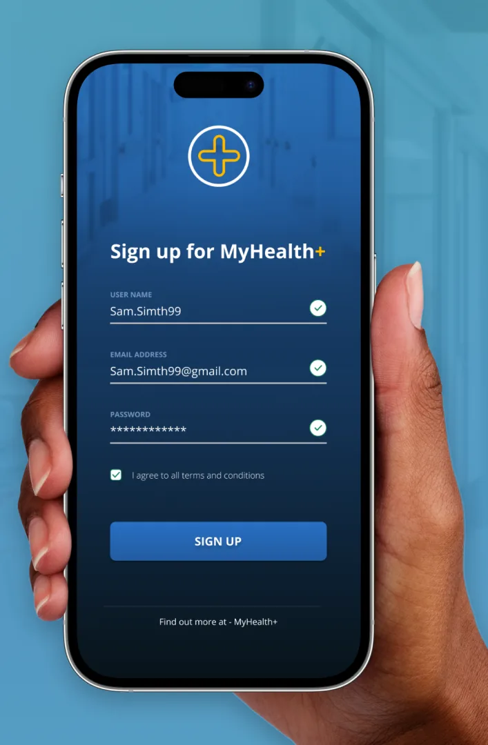
Sign-up is the first real conversation a product has with someone, and every field is a small ask for trust. I focused on keeping it to the essentials, making the primary action unmissable, and giving the form room to breathe on a small screen.
The interesting constraint was hierarchy: what the eye hits first, where the thumb naturally lands, and how you signal progress without clutter. Getting a ‘simple’ screen to feel effortless is harder than it looks.
The simplest screens punish sloppy hierarchy the most.
This was day 1 of a 14-day daily UI challenge. You can browse every screen in the full challenge gallery →
← Back to all posts.webp)

