14 Day UI Challenge

In 2024 I've set my sights on the 14-day UI challenge.
My goal is to enhance my expertise by melding business acumen, product design, and UX into more refined UI work, enjoy!

Click on the images below to jump to any challenge
Day 1
Create a signup page, modal, form, or app screen related to signing up for something.
I designed a registration process for a health app, even though I haven't previously worked in the health field. It felt like a great chance to explore something new. I stuck to my preferred colours but challenged myself to keep the design as minimalistic as I could.
Day 2
Design a credit card checkout form or page.
Taking a cooking class with Jamie has always been on my mum's wish list. So, I wanted to bring a taste of that dream to life with this design—$35 for a cooking session with Jamie Oliver? Who could resist?

With this design challenge I aimed to use red in a way that feels lively and inviting, steering clear of any negative or off-putting vibes.
Day 3
Design a landing page
This project was a departure from the norm—my wife proposed the idea of crafting a fictional book cover using Midjourney. I embraced the challenge and expanded it further by designing not only the book cover but also the landing page in Figma.

It was quite a challenge because I lacked knowledge about the subject matter. I scouted author websites for inspiration, but they didn't offer much, and my wife was improvising details as I progressed. Adding to the complexity, the color scheme and font weren't exactly what I'd typically choose. But hey this is why it is called a challenge :) 
Day 4
Design an app icon
Today marks day 4 of the design challenge, where I was tasked with crafting an app icon for a dog cleaning company. I aimed to push my boundaries on this one, attempting to utilize the 3D tool in Spline.

Unfortunately, it didn't yield the results I hoped for, leading me back to my trusty Figma. Nevertheless, I found satisfaction in my attempts with Spline.

Creating an app icon was a first for me, presenting an enjoyable challenge—considering how it would appear in a smaller format. If given another chance, I'd opt to simplify the design further, aiming to make it stand out on a phone screen.
Day 5
Design a calculation element or interface.
On the fifth day of my design challenge, I delved into crafting a calculating interface.

This project held personal significance; my daughter underwent open-heart surgery at just six days old. This experience led my wife and me to establish a meticulous feeding schedule for her. Constantly calculating the right amount and timing for her milk became essential.

As a result, I took on the challenge of designing a milk feeding calculator specifically tailored for an Apple Watch—an entirely new endeavor for me. I'd love to hear your thoughts on this project!
Day 6
Design a User Profile.
Day 6 of the UI challenge had me tackling a user profile design. I envisioned a platform where people could explore designers and hire them based on their work.

However, finding inspiration was tough as most profiles were either too basic or lacked real work examples. Still, I pushed myself to craft a compelling concept even without much inspiration to draw from.
Day 7
Design a Settings Page.
On Day 7 of the UI challenge, I took on creating a settings area, a task that felt like second nature thanks to my experience at Friendly Manager and working with diverse clients. Today, getting new bikes sparked an idea to design a settings area specifically for mountain bikers within a user profile.

My goal was to maintain a clean and simple design while ensuring all the necessary elements were present.
Day 8
Design a 404 Page
Audi needed a new 404 page On Day 8 of the UI challenge, I tackled the redesign of a 404 page.
This challenge was a blast!

404 pages tend to be last-minute creations for designers and web developers, so I wanted to give one a makeover that I felt needed some attention and creativity. I decided to revamp the Audi New Zealand website's 404 page.

Take a look at the before and after versions. I aimed to incorporate elements of a road, traveling and a bit of humor while maintaining a professional appearance.p.s please note this not an official work for Audi New Zealand, and the car is not an Audi.
Day 9
Design a Music Player.
Oh boy, talk about a challenge! So, Day 9 of the UI challenge was all about designing a music player, but I didn't want to just revamp Spotify.

I went a different route: I created a Kid-Friendly Music Player for my little one to jam out with.

Let me tell you, making something that a toddler could use was tough! I had to ponder, what would a toddler need in a music player? How do I make it fun yet tidy? It really got my creative gears spinning. I'm not entirely satisfied with it yet, but it's a good start.

This challenge was so much fun though; it really made me think outside the box. I'm already planning to give it another shot when I have some free time. But for now, here's version one of KidsMusic - the ultimate kid-friendly music player! 🎵🎉
Day 10
Design a Social Share Tool
In my design challenge for Day 10,I took on the task of creating a share tool for social media, specifically tailored for sharing images. Crafting an efficient and user-friendly sharing experience was my primary goal.I wanted to get a balance between simplicity and functionality, I aimed to make the sharing process not only intuitive but also visually appealing.
Day 11
Design a Flash Message with both the error message and success message
For UI challenge 11, The task at hand was to create success and fail messages for uploading images...

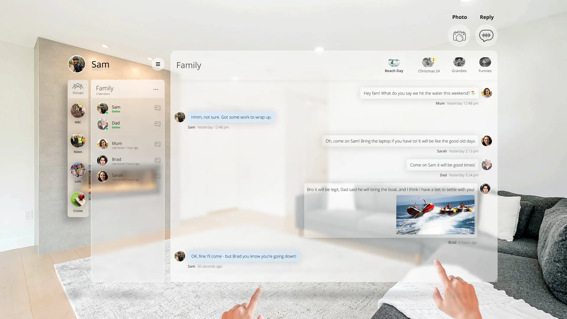
Now anyone who knows me knows that at some point cricket had to be included in the challenge.

Crafting messages that would either make you want to do a victory dance or run for cover was no small feat and using Chat GPT was helpful here. As I tried to hit the design boundary, I found myself caught in a few bouncers.

But hey, that's the thrill of the game, right? I managed to swing it in the end – creating messages that would either make you feel like you hit a six or got clean bowled.

Now, let's hope my UI skills are more "smashing" than a powerful straight drive! 🏏🤣


Success Text -That file had some serious power behind it. Bro you have hit that for 6 straight back over the bowlers head, Great shot mate!

Fail Text - Aw, bro, your file just had a classic 'underarm bowl' moment – went for the upload slog and ended up hitting the wickets.... mate what happened!🙂
Day 12
Design an ecommerce site

UI Challenge 12 threw me into the sweet world of designing an e-commerce shop, and given the summer vibes down here in NZ, I decided to whip up a category page for a local classic NZ ice cream brand - Tip Top Ice Cream

Picture this: you can snag your favorite ice cream directly from the wholesaler. It was a blast dabbling in splats and swirls, and dealing with images that needed a little Photoshop magic to blend and generate those tasty photos.

Mixing an advertising at the top of the page into the e-commerce platform made it even more interesting.
Day 13
Design an messaging app

Challenge 13 took me on a wild ride where I blended Slack, Facebook, and virtual reality into one messaging app extravaganza! Picture this: a futuristic space where mixed reality meets cutting-edge UX/UI trends, specifically diving into the Glass-Morphism craze. Crafting a messaging app for the future meant considering the absence of keyboards and mice, making me ponder about depth, shadow, and user interaction in this immersive environment.

It was a fantastic journey into the unknown, exploring the transition between the present and the future of technology.

This challenge had me buzzing with excitement as I ventured into uncharted design territory, and it left me daydreaming about the endless possibilities awaiting us in the future of design! 🚀✨
Day 14
Design a Timer

Picture this: a sleek, futuristic countdown interface that captures the anticipation and excitement of a space journey. On Day 14, I needed to design a timer, I wanted to experiment with futuristic space feel.

The numbers tick down as the rocket readies itself for the interplanetary adventure. I incorporated space-themed visuals, with each second bringing the rocket one step closer to its Martian destination.