
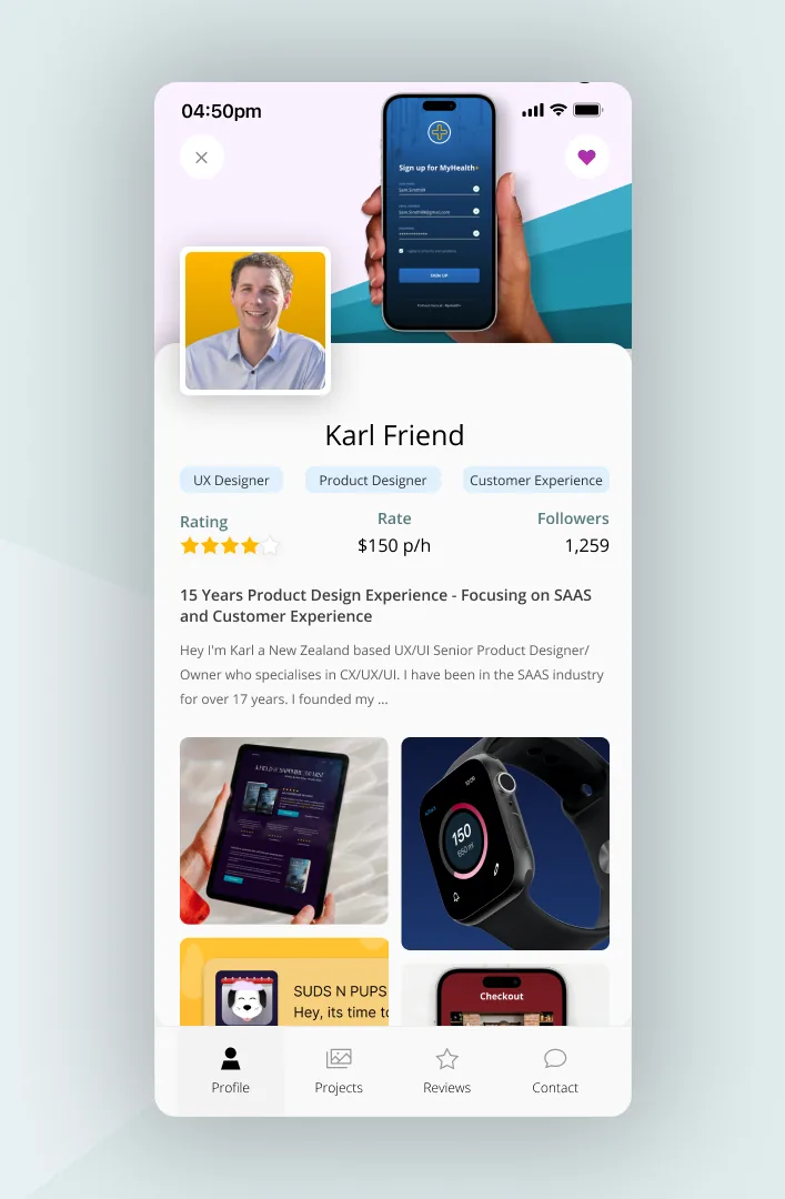
A profile screen has to hold a lot — identity, stats, settings, actions — without feeling like a dashboard. I focused on a clear top-level identity, then progressive access to everything else.
The balance was between showing enough to feel personal and hiding enough to stay clean. Structure did most of the work; decoration did very little.
A good profile screen answers ‘who am I here, and what can I do’ at a glance.
This was day 6 of a 14-day daily UI challenge. You can browse every screen in the full challenge gallery →
← Back to all posts.webp)

