
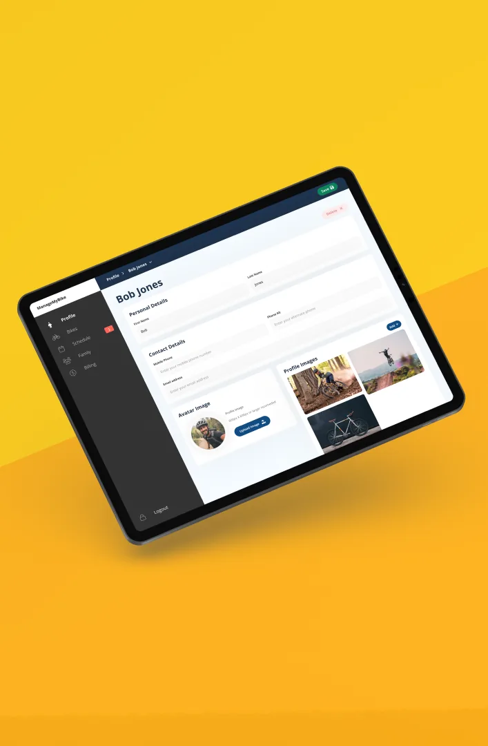
Settings live or die on grouping and labels. I worked on logical clusters, plain-language labels, and predictable controls, so people can find and change things without thinking.
It’s a screen users only visit when something’s wrong or they want control — so it has to be calm, scannable, and utterly unambiguous.
Nobody praises a settings screen. They just quietly find what they need — that’s the win.
This was day 7 of a 14-day daily UI challenge. You can browse every screen in the full challenge gallery →
← Back to all posts.webp)

